Oculus Rift DK2 Review
August 2014
The Oculus DK2 is out and I have to say it’s definitely a step above the DK1. I wasn’t a big fan of the DK1. You can read my review on the first generation Oculus Rift DK1 here. However, I really like what Oculus has done with the DK2.
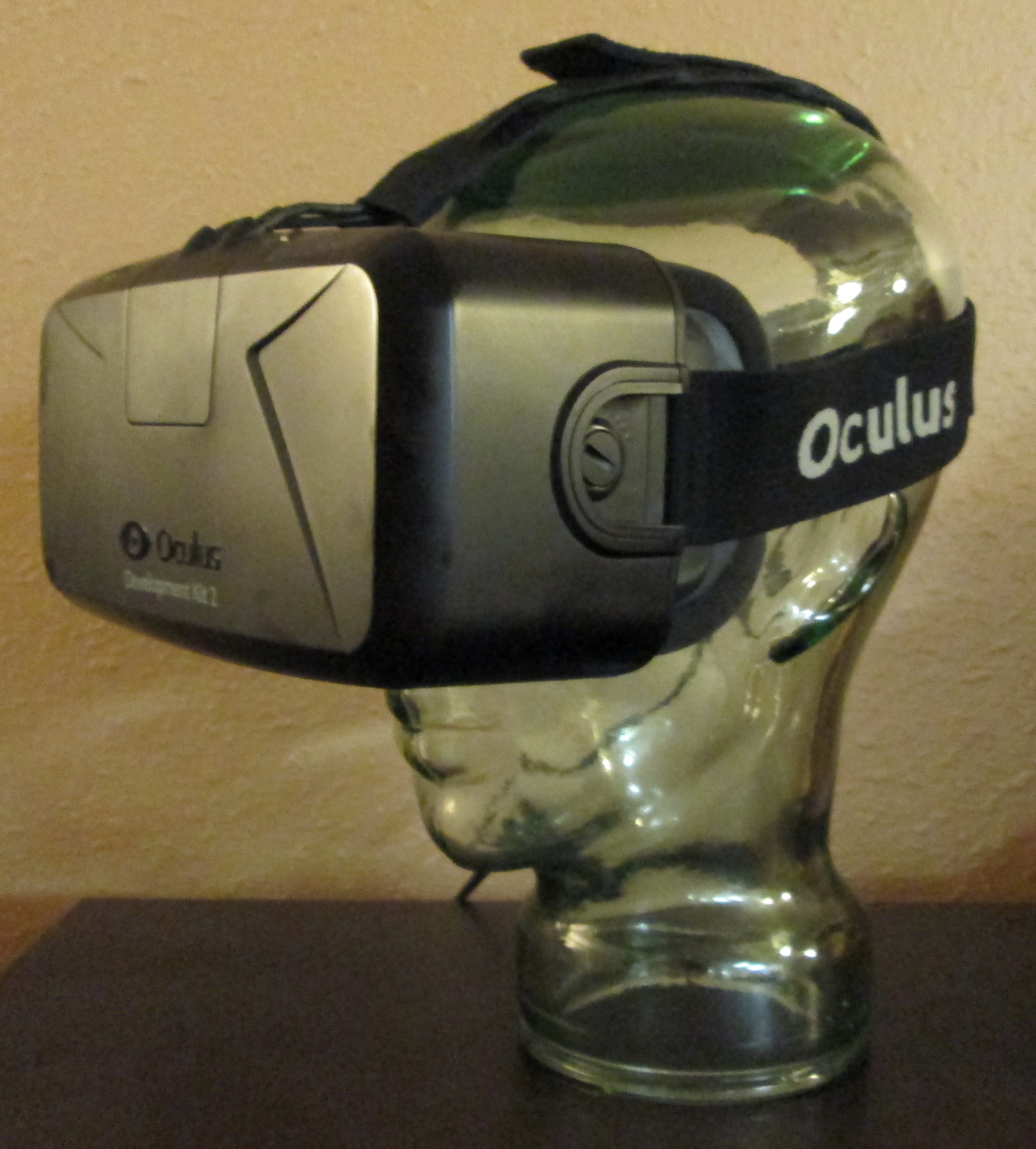
The Display
The DK2 uses a 1920×1080 PenTile OLED display from the Samsung Note 3. This panel gets split to 960×1080 per eye. With an OLED panel comes beautiful saturated colors, deep black, and a reduction in display smear. Oculus is also controlling the duty cycle of the OLED rows to achieve what they call low persistence. This reduces the display smear even further. The new PenTile OLED display removes two major issues DK1 had and that was low contrast display and display smear.
PenTile comes with it’s own issues but they’re forgivable. You’ll see colors along high contrast edges that change as you span a scene. This is typical of a PenTile display if you’ve ever seen one up close. However, most of the time it’s not noticeable. There’s still a heavy screen door effect with it looking more honeycomb now. Again, this is due to the structure of the PenTile display and the fact that 1920×1080 still isn’t high enough resolution for the field-of-view (FOV) of the Rift.
I’ve read some comments about disappointment in what the display looks like resolution wise. These comments are people not understanding what resolution and field of view means in an HMD design. The display looks exactly as I would expect given the specifications. You can review my FOV comparison page for a bit more background on resolution vs. FOV. Just because your monitor or phone looks high resolution at 1080p doesn’t mean an HMD will. You have to consider what the optics are doing to the panel.
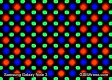
A PenTile display also has lower color resolution than the actual reported 1920×1080 pixel resolution of the display. You can see why in the image above from GSMArena.com. You can see that the color pixels alternate between red and blue with green pixels in between. This is kind of like the earlier days in HMD design where people reported the number of sub-pixels, or color elements, as the resolution of the panel. Some have criticized PenTile for this arrangement but I think it’s a great display. I originally had a 1280×800 version in my Samsung Note 2 and it was the nicest display I had seen in a phone up to that point.
Display Smear (non low persistence)
I’ve run some tests on this panel for display smear as well as measured the color. You can see the results below compared to the DK1. Keep in mind that these smear results are just due to the improved frame rate of 75Hz of the DK2. Turning on low persistence will drop this even lower. I don’t have those results as I didn’t have the SDK available to turn low persistence on. Oculus claims 2ms, 3ms, and full modes for low persistence. Full will be equivalent to the results shown at the various frame rates. 2ms would be equivalent to a frame rate of 500Hz and 3ms would be equivalent to ~333Hz. At 2ms you can expect 6.5 times better smear reduction than the shown 75Hz result for DK2. At 3ms, about 4 times better. The results are quite impressive and quite noticeable in use.
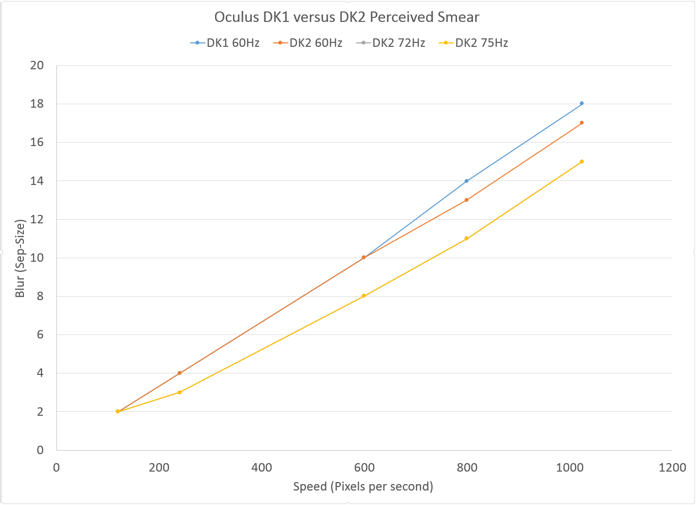
When I can get the Oculus 0.4 SDK integrated into my test program, I’ll update these smear results with the low persistence modes. Reducing display smear is a huge deal because once you get the tracking low latency and you get your frame rates up, display smear is the next thing that makes you sick. This is primarily because the world goes blurry as you pan your head around. If you have a DK2 you can experiment with the how drastic the difference is by running in 60Hz mode and then at 75Hz where, at least for Elite: Dangerous, low persistence is enabled.
Color
Like I mentioned, color has also drastically improved in the DK2 over DK1. You can expect this type of result when going to an OLED panel. Below are some measurements using a colorimeter to show the difference. Here the horse shoe chart is what the average human eye can see for color. If the display was ideal it would completely fill this horse shoe with color. The colored triangle shown is the sRGB color space, which is a typical monitor color space. The outline of a red triangle is the DK1 and the blue triangle is the DK2.
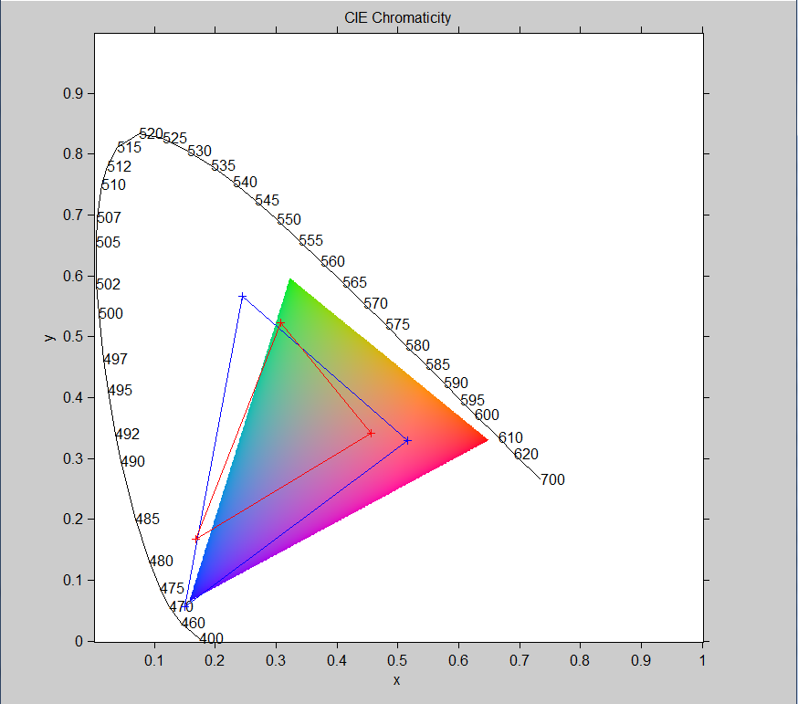
You can see how much more area the DK2 triangle covers. That’s why the display looks so much better than the DK1. Fully saturated green would be at the top of the horse shoe, blue at the bottom left, and red at the bottom right. You can see that the DK2 has really nice blues. Having deep blacks and much higher contrast really makes you forgive the low resolution of the panel. It looks nice.
Shown below are my FOV images from my FOV Comparison page for HMDs. You should immediately be able to see the color differences in the image as well as resolution. The OLED display looks even better when you actually see it. Hopefully the aliasing due to resampling isn’t too bad. It seems to vary quite drastically depending on your browser setup. You can right click and save the image to see it at the full resolution of the camera.
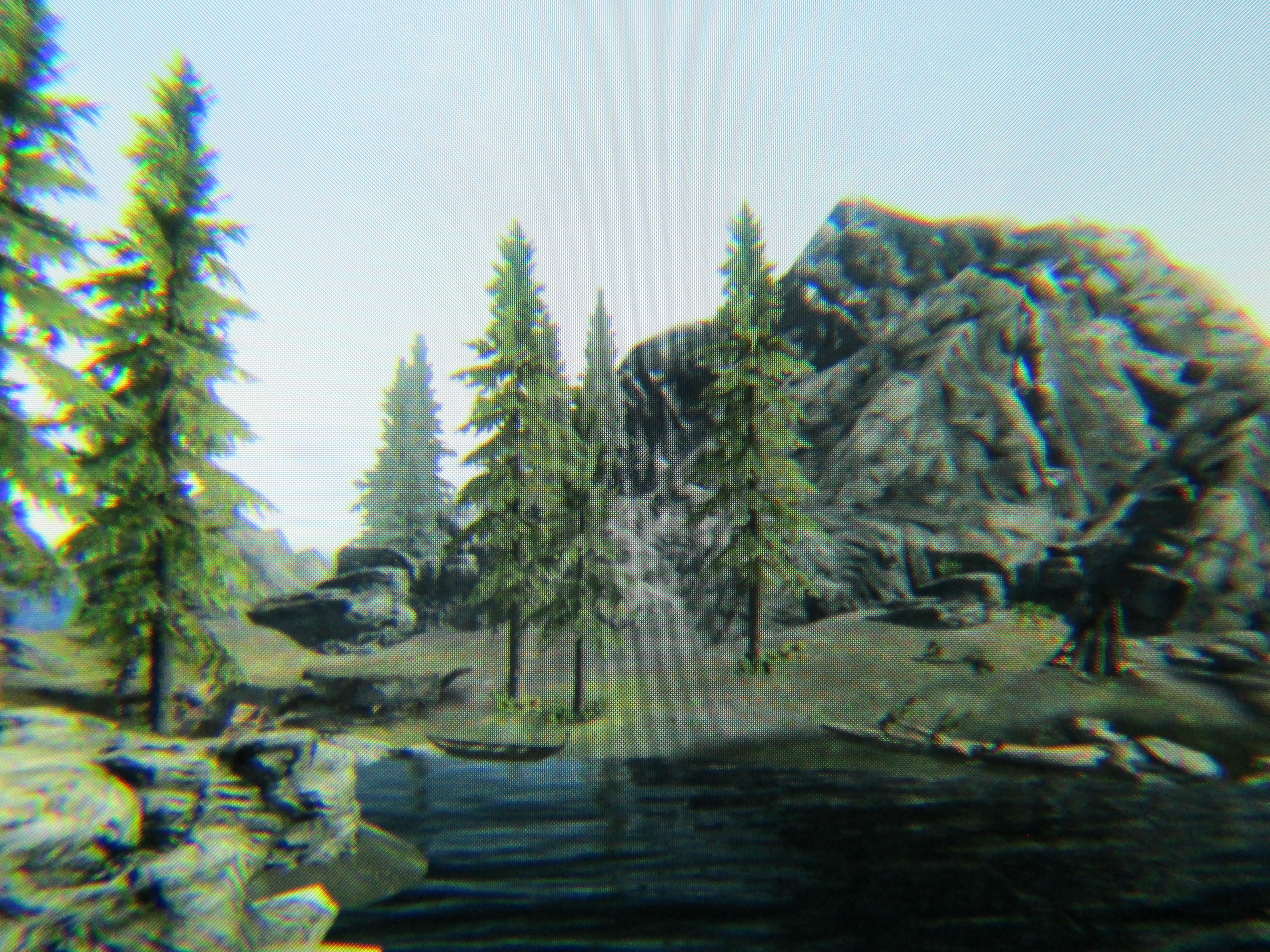
Oculus Rift DK2. 960×1080 pixels. 90 deg. H.FOV. Over fills camera FOV. 5.625 arcmin/pixel |
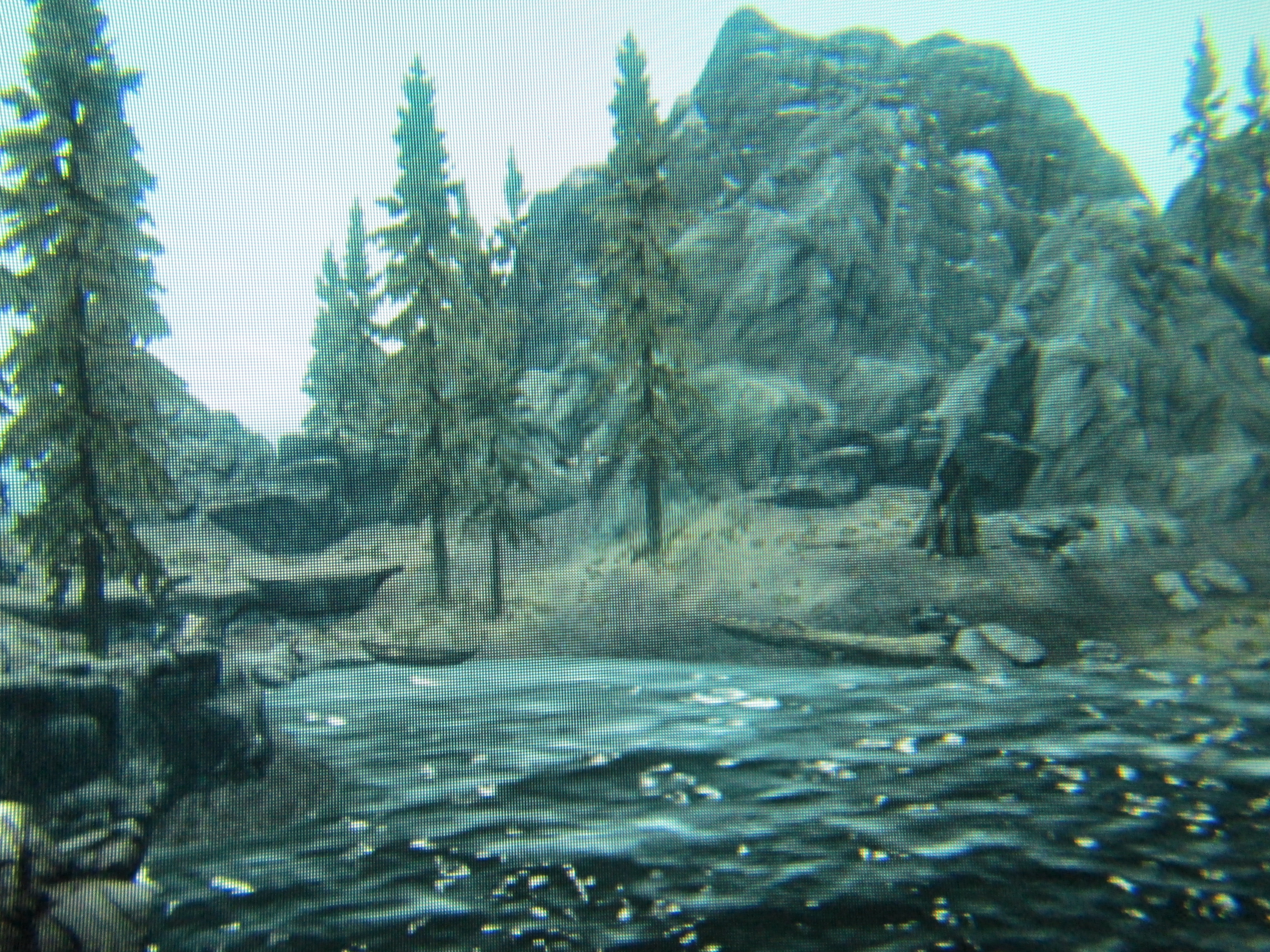
Oculus Rift DK1. 640×800 pixels. 90 deg. H.FOV. Over fills camera FOV. 8.44 arcmin/pixel |
Positional Tracking
The next biggest thing provided by DK2 is the positional tracking using the LEDs under the DK2 hood and the external camera. This is really a nice feature. It’s quite convincing to peak around a corner in a game. In the Oculus DK2 demo of the desktop, it’s really impressive to be able to kneel down and look under the table. The only downside is now you’re stuck within the camera FOV for positional tracking. However, Oculus has done a nice job at making the positional tracking track about 180 degrees of space by putting LEDs on the sides of the DK2 as well. They’ve probably done just about as good as anyone could do with a single camera. It’s really quite impressive to have this built into a $350.00 HMD.
Overall Construction
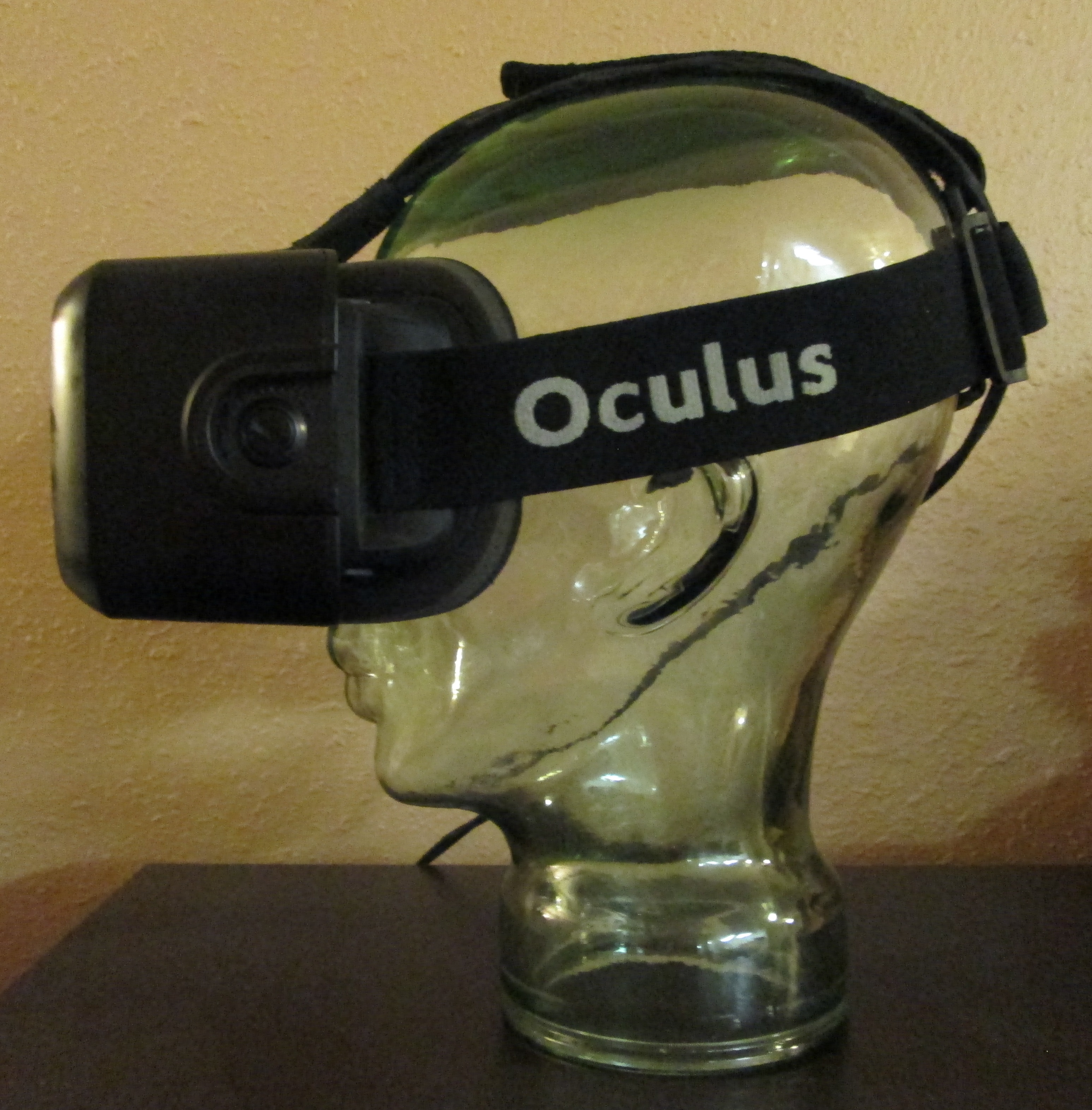
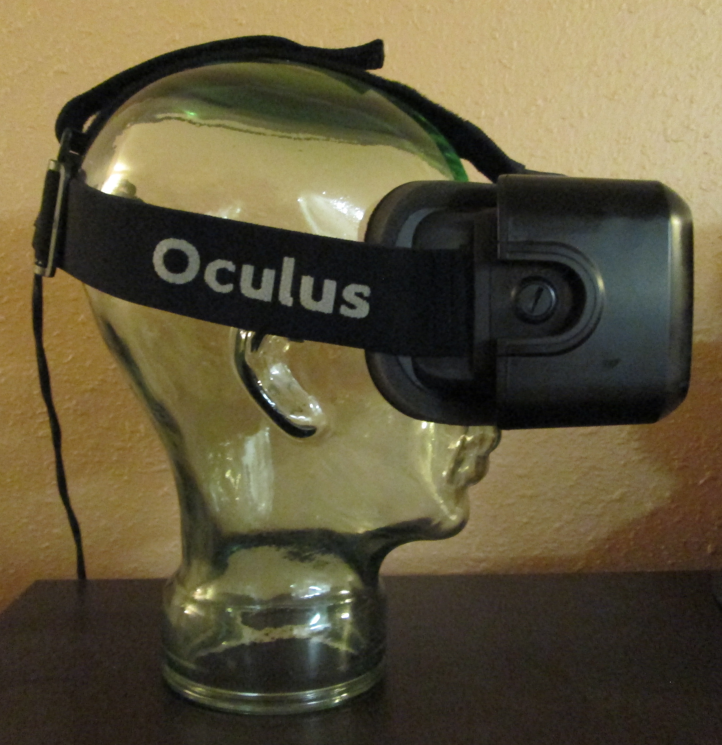
The DK2 is overall a bit smaller than the DK1 due to it’s 5″ panel versus the previous 7″ panel. There’s no external control box now which is nice. Overall the HMD looks a lot more professional than the DK1. I also really like the hood over the HDMI and USB cables which makes everything look integrated, yet you can still take it off to remove the cables. Really nice. The system is black again as expected. The DK2 case seems to grab oils from your hands more than the DK1. Otherwise it’s very similar to the DK1 construction. There are newer bigger lenses but they’re not all that much different than the DK1. They do require a different distortion map however. I wish the DK2 came in a plastic case like the DK1. I thought that was really professional looking. The DK2 comes in a cardboard box but it’s a nice box.
|
|
Games/Demos
There are demos and games coming out everyday. You can find an updated list at the Rift Arcade. It’s updated almost daily. DK2 “supported” has a wide range. It seems to mean everything from only distortion correction to full implementation with positional tracking and low persistence. I personally don’t think developers should claim DK2 support if there’s no head tracking but you’ll find them in the Rift Arcade list. It’s still the wild west as everyone tries to grab attention for their applications by claiming DK2 support.
By far the two best games so far are Quake 2 and Elite: Dangerous. Quake 2 is an nearly flawless demo of the DK2 capabilities. It has separate gun and head tracking, low persistence, and positional tracking. It really just looks amazing. You have to try it! Elite: Dangerous is also quite good. The cockpit in this game is one of the best I’ve seen in 3D. There are 3D panels which pop up as you pan around and float in 3D space. It’s really quite impressive. You can lean around your cockpit as well with the positional tracking. Bravo! Probably the next best game is Radial-G. But be careful, Radial-G isn’t for people who have never tried VR before. It’s likely to make you sick.
There’s even the original Quake which I’ve played on many many VR headsets. It looks great! I find it so funny to be playing these again on a new HMD. Things haven’t changed that much!
Some Issues
There are issues with every HMD and Oculus DK2 in no exception. There is a black smearing of shadows that occurs. It can also turn a slight tint of red, green, or blue and will change color as you pan. It’s not always noticeable unless you’re in a very dark room with lots of shadows. Then it smears all over the place. People are attempting work arounds. Quake 2 mentioned above does quite a good job at minimizing it. So does Elite: Dangerous.
The color shifting at sharp borders is a small issue. Like I mentioned it’s typical of a PenTile display if you’ve worked with one. Most of the time I don’t notice it.
The portrait mode of the DK2 is a pain in the ass. Once you have it setup correctly by rotating it in windows, it’s fine. However, if something weird happens and it flips around it’s a pain to sometimes correct. It also throws mirroring displays out the window. This is a big draw back as you still can’t see everything on the DK2 screen when prewarping isn’t being applied.
The adjustments on the side of the DK2 for eye relief also seem a bit weak. They always seem to move over a few clicks every time I put on or take off the HMD. The DK1 versions were better. Annoying but not a big deal.
There is also some blurring of the image as you move your eye off the central optical axis. What this means is that the image is the sharpest when you’re looking straight ahead. Typically this is what you’re doing, however because a screen is strapped to your head, you can look at the peripheral areas of the display with the central portion of your eye. Some will say this is like your eye. Not quite. If the sharp center followed your eye then you’d never notice the difference. However, because the display is fixed in relation to your eye you see the blurry areas along the outer edges of the display. This is a tough problem to solve in HMD design. I personally don’t mind it but others may disagree.
Be very aware of what you’re buying if you purchase the DK2. The DK2 is still a ways away from a consumer product. If you’ve used VR gear of the past, they’ve never been plug ‘n play. I’ve always had to play with drivers, launch various software, and generally fiddle with things to get everything working. This is still true of the DK2 and the current list of demos. I would say even more so than the DK1. If you don’t know your way around a computer or software then stay away as you’ll most likely be very frustrated. There is a reason Oculus calls this a Developer kit. However, if you’ve used VR gear in the past you’ll be right at home. It should be easier but currently it’s not.
Conclusion
Overall the Oculus Rift DK2 is a step above the DK1. It’s clearly had a lot of thought put into the design, features, and packaging. The OLED panel brings reduced display smear, beautiful colors, and high contrast imagery. The panel alone makes a huge improvement in any Rift VR experience. Positional tracking is also quite impressive and will probably be the first time most people have experienced that type of tracking. The fit is very comfortable just like the DK1.
The resolution of the panel is still too low and I’m guessing we’ll see a 2560×1440 panel (rumored Note 4 display) in the consumer version. I’m secretly hoping Oculus will blow peoples socks off and include a 4k panel in CV1. Even at a 4k panel you’ll still see those pixels, but they’ll be small.
For a $350 dollar HMD I don’t think anyone can do any better than Oculus. It’s really a cool HMD and will probably sit on my desk for some time to come. Great job Oculus!
 Mellott's VR